Introduction
Eco Baby is an organisation that promotes sustainable practices by facilitating the donation, reuse, and sale of second-hand clothes and accessories for babies, children, and parents.
They require a tool to manage items that people no longer need or want, and their target audience is parents and individuals who are interested in reducing their consumption of baby items.
Summary
My Role
UI/UX Designer
Timeline
9 weeks
Tools Used
Figma, Photoshop
Process
Research
Examine the market
Design + Testing
Craft visuals and battle-test
User Test + Feedback
Gather valuable intel from users
The
Problem
183 million pieces of kids' clothes end up in landfills each year due to a lack of awareness about recycling and reusing them. Design a Eco Baby App aiming to raise awareness and encourage sustainable practices among parents and caregivers to reduce clothing waste.
Goals
1
Develop a website and mobile app to manage baby clothes and accessories waste
2
Users can donate, sell, and purchase items through the platform
3
Empower parents and caregivers to reduce waste while promoting sustainability and community involvement
User research
The users are parents and caregivers: Introducing Justine
39 / UCM University / Madrid / Partner and toddler / Veterinary
“I want to provide clothes and accessories for my child and donate once they are no longer needed”
Justine is a busy working mom. She enjoys buying clothes and things for her toddler but wants to spend her time more efficiently without spending too much time trying to find items on the second hand websites and apps.
She occasionally goes to second hand stores where she can find items but not always exactly what she needs in that precise moment.
Her Goals: Explore clothing and accessories for her children. Save money by acquiring second-hand or gifted items. Smoothly donate or swap after using the product.
Her Frustrations: Websites and apps encompass general markets and lack specific sections for used baby and kids' marketplace merchandise.
Marketplace Features
Generous Donations
Donate gently used items, giving others a chance to enjoy them.
Easy Sales for Sellers
List items you don't need and make some extra cash.
Affordable Purchases for Buyers
Buy items at a discounted price, saving your wallet.
Reliable Ratings
Get insights with ratings and reviews from trusted buyers.
User Flow
Browsing for items: Open app
Upload item to sell or donate
Site Map
Arrangement and framework
Created a sitemap to organize the website's structure and provide a visual representation of the various screens and their relationships.
Pattern
The sitemap will serve as a template for the app's design, ensuring a consistent flow and intuitive navigation.
Sketches of app
App Flow
Concept User Testing
After designing the prototype of the final design, I solicited feedback from potential users and this is what a few of them said:
The bright rainbow colours are fun but makes it difficult to read.
Working mom (49)
The different categories in clothing makes it easier and faster to find specific items.
New father (29)
Buttons from the homepage could be bigger with large image and text to clearly indicate each category.
Grandmother (68)
I redesigned some elements after receiving user feedback: bigger buttons to the homepage, making the color scheme more minimalistic and clean, providing a clearer indication of what sections the app provides, and a smaller selection of items near you.
Typography
Montserrat is a geometric sans-serif typeface designed by Argentine graphic designer Julieta Ulanovsky and released in 2011.
Final App Design
Shopping
Uploading an item
Managing account
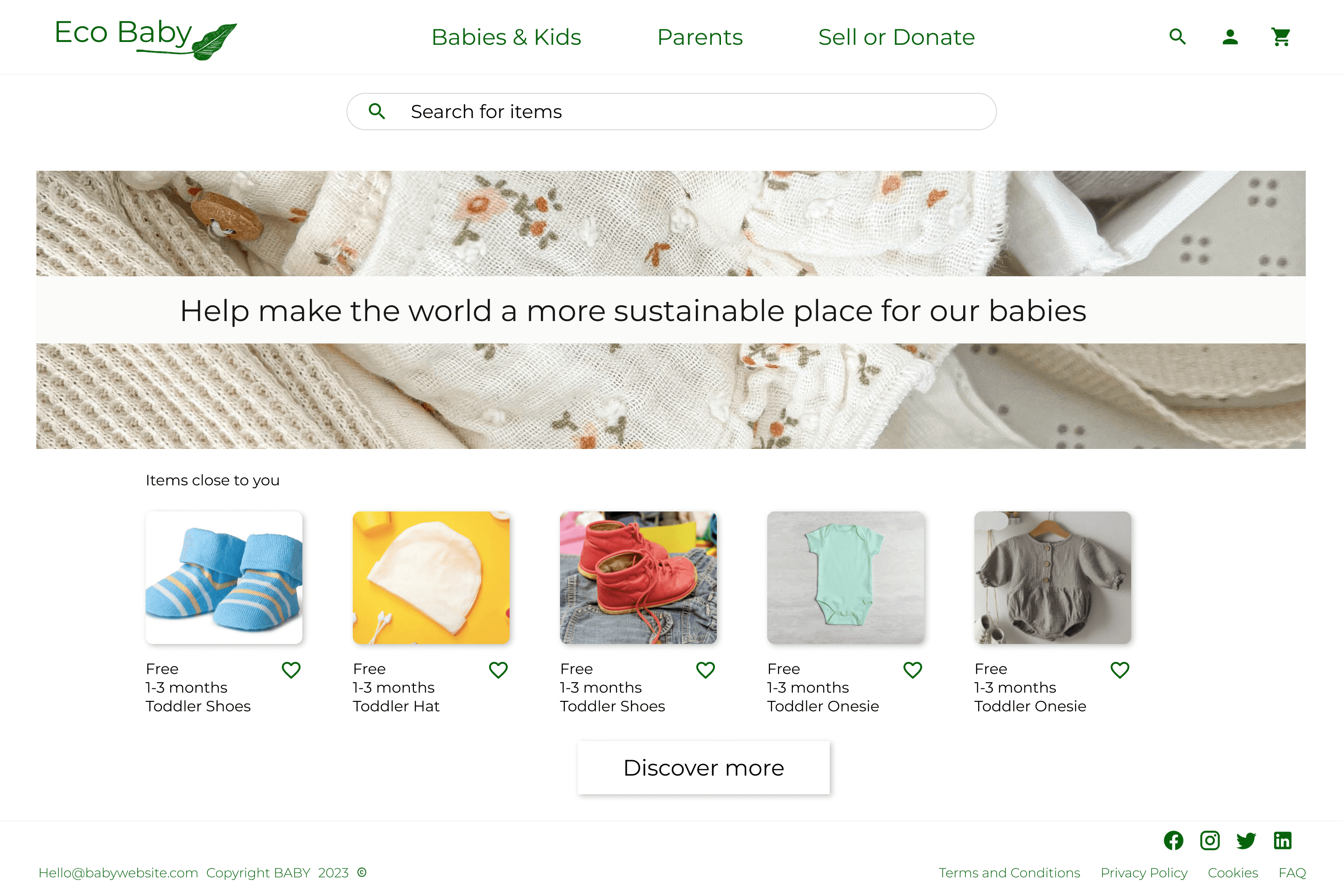
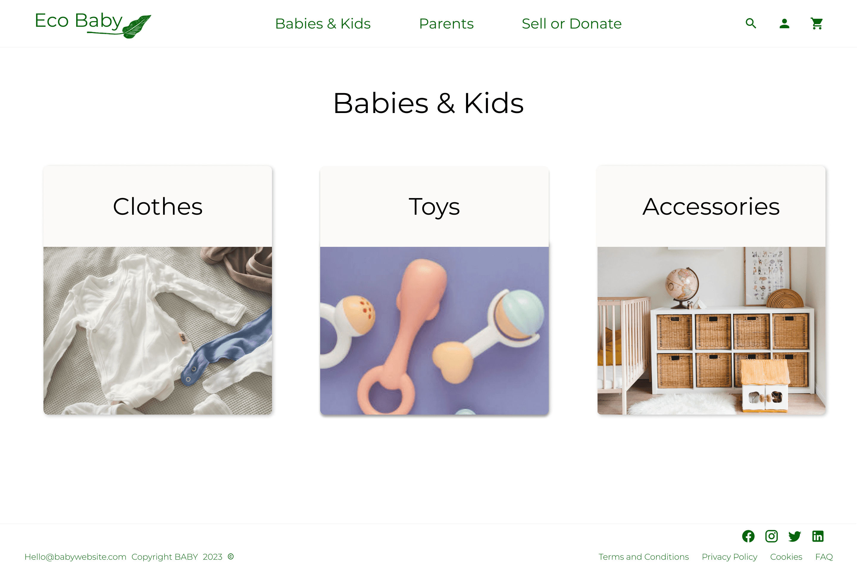
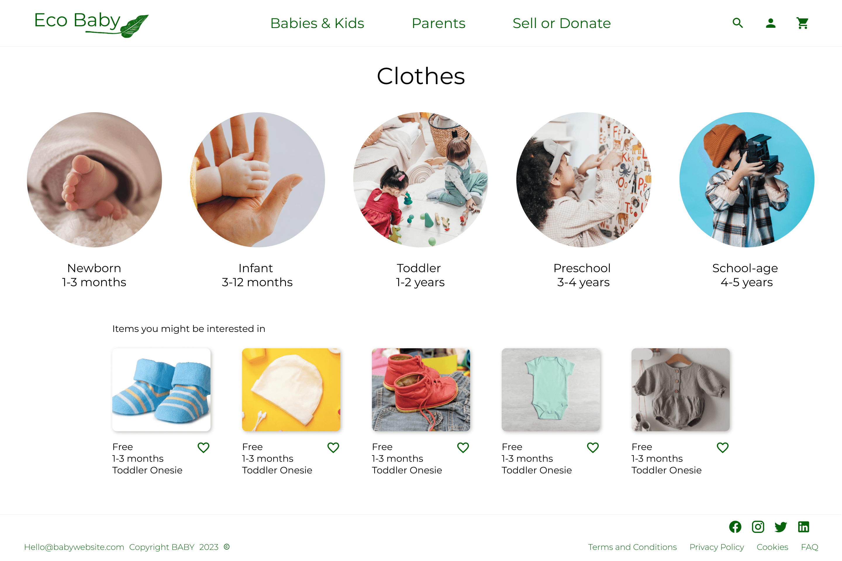
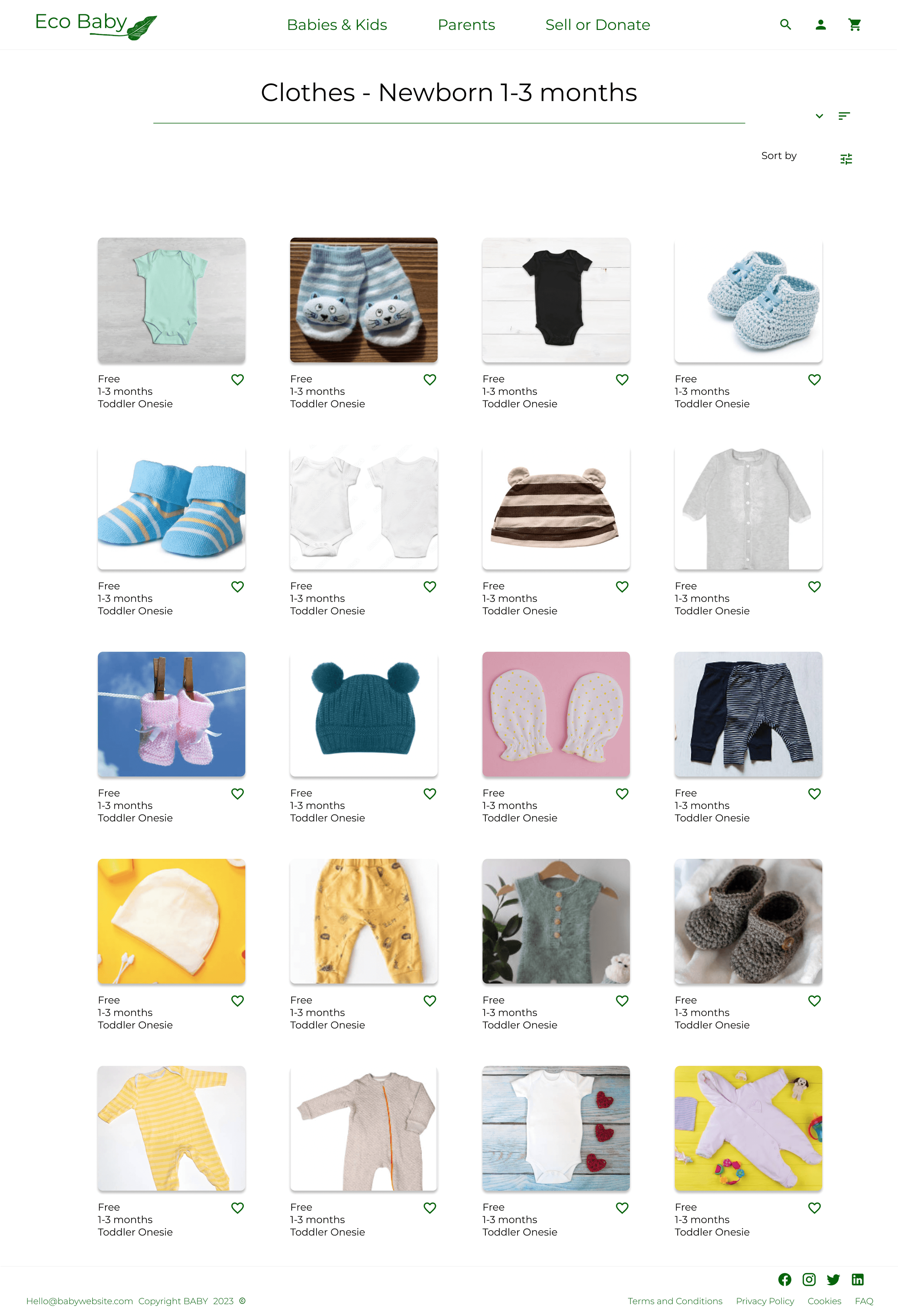
Accompanying website design
Used similar design elements and color palette as the app to ensure consistency during the experience for the users
Final Website design


Learnings
According to user feedback, the app has the potential to facilaitate process of donating clothes and buying second-hand items much more accessible.
One user commented that "the Eco Baby app brings environmental consciousness to a personal level, and does so in an engaging and user-friendly way."
This feedback has taught me the importance of thoroughly following the design process and considering the needs of the user in order to create feasible and useful solutions, even when tackling a significant problem.


